
Examples
This page illustrates specific examples. As these are relatively elaborated, we suggest that you read the Tutorial before adapting these examples to your needs. To understand the layout details, see the Parameters reference. In each example, the "download" button provides the corresponding input .xlsx file.
SR15 and AR5 Reasons for concern

Data: Adapted from 10.5281/zenodo.3992857, itself based on information
from the IPCC reports.
Note: As SR1.5 only evaluates risks up to 2.5°C, the upper limit of validity is changed in between the data tables.
Layout: This example shows axis tick marks and minor tick marks (every 0.5°C = 2 minor ticks by major tick mark) with grid lines only for user-defined levels.
Note: here the embers are in the same order in the table and on the figure. When a figure needs to have a different order than the related table, even with a different grouping of embers into "panels", it can be done without changing the data table, hence without risk of errors. It is explained on the page describing parameters.
AR5 Synthesis Report ocean acidification embers

Data: This example is a partial reproduction of IPCC AR5 Synthesis Report (SYR) topic 2 figure 5.2, limited to the embers in the central panel. The data is based on the analysis of the colours in the published figure (in the same way as the previous example). However, the original version contains tiny details, almost invisible, which are not reproduced here. Therefore, if you want to use this data, please e-mail us.
Layout: This example shows a case without vertical axis line (as in the original), with an "hazard" scale other than global mean temperature increase (CO2 concentration)
Special report on Ocean and cryosphere (SROCC)

Data: Table SM 5.6b and SM 5.8b from the SROCC, retaining only the embers in SROCC Fig SPM.3 panel d. For the original version, see ErrataFigureSPM3d.png from ipcc.ch.
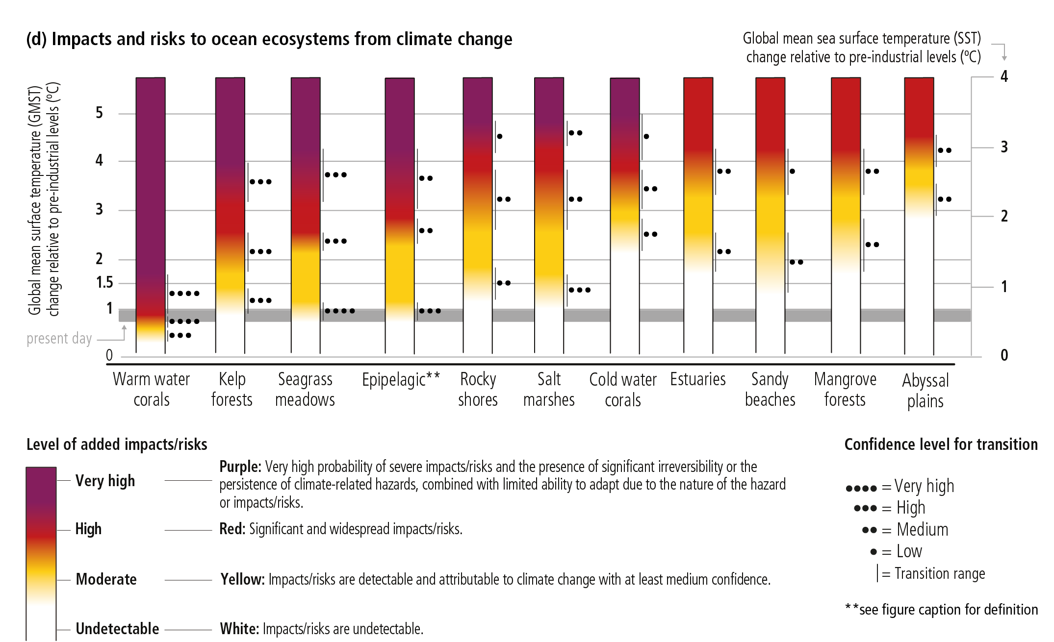
Layout: The layout is quite close to the original, showing a range of temperatures as grey background ('present day' = 2006-2015, with a 'label offset' defined in the Excel file to move that text down and thus avoid overlapping the axis data).
Experimental ember to illustrate potential benefits

Data and objective: Arbitrary illustrative data to show how potential benefits of climate change (in specific regions and sectors) might be illustrated. More generally, this shows how new "risk level names" can be added: by providing these together with the related colors within the "Color definitions" sheet of the Excel file. The allowed transition names are defined automatically on the basis of the risk levels names (for example, defining 'moderate benefit' in addition to the traditional 'undetectable' risk level allows for using the transition name 'undetectable to moderate benefit').
Although we've given this risk scale some initial thought, we don't claim that it should be used as is: feel free to adapt the names and/or colours to your needs and let us know what you think.
Notes:
-
As in other diagrams, the grey area on top of the "benefits" ember means "not assessed at this level of change". It is the area above the GMST (or other hazard metric) specified by the parameter "haz_valid_top".
-
We would like to thank Dr Eunice Lo (Uni. Bristol) for the discussions on 'how to illustrate benefits' which contributed to this development.